blue is not just blue
I have been thinking about how we describe colour. This was prompted by my quest to find the perfect blue for a cardigan I want to knit. Perfect for me, not perfect perfect. I find it all utterly confusing. Look at the colour palettes of the Cascade yarns for example here. These are some of the blues listed:
midnight - summer sky - cobalt - sapphire - Westpoint blue - smoke blue - spectrum blue - Como blue - blue velvet - hyacinth - denim - blue - Carribean - blueberry - aporto - navy - Puget sound - skylight blue - in the navy - blue horizon - baby denim - colonial blue - cerulean - mallard
So many questions come to mind. How many blues does one possibly need? The abundance does not make for easy decisions.
Who decides how to name the shades of yarn? There appear to be common names, for example navy blue, a colour that is well known and most of us can picture this shade of blue. But other names seem to be pulled out of a hat, for example 'Mäuseballett auf der Wiese' (mouse ballet on the meadow), a Wollmeise yarn. Guess the colour of that one before you click on the link!
Going back to the blues above. What blue is the summer sky? What part of summer and what time of day does it refer to, and above which lands are we gazing into the sky? Would it be the same place where we also spot the midnight sky?
And what about denim? None of my denim jeans are the same shade of blue. Unwashed denim is a proper dark blue, almost navy more blue (if that makes any sense), the Cascade shade shown is much lighter, maybe that of a pair of my jeans worn and washed weekly for a year? Was it an arbitrary decision or was the yarn colour decided upon in a time when dark jeans were not fashionable?
What is the difference between navy and in the navy blue? It must be a linguistic finesse that I can't crack.
What about cerulean? I like the sound of that one. Before I looked it up, I thought this colour name reminds me of whales but I got muddled up with cetacean, which is the order name to describe whales, dolphins and porpoises.
This is what Wikipedia has to say: 'cerulean, also spelled caerulean, is a color term that may be applied to certain colors with the hue ranging roughly between blue and cyan, overlapping with both. It also largely overlaps with azure and sky blue, although cerulean is dimmer.' I am none the wiser. The word cerulean derives from caeruleus, which is Latin for dark blue, or blue green, and this probably derives from caelulum, a diminutive of the latin word for sky and heaven, caelum. A sky blue then? Would the cerulean blue refer to a different sky blue than the one above?
Apparently Pantone crowned cerulean the colour of the year 2000. The code is #15-4020. I looks quite different from the cerulean the Cascade yarns dye master creates. Less white in the blue I guess. I prefer the latter.
 | |||
| Pantone cerulean |
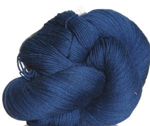 |
| Cascade Heritage yarn in cerulean |
I like the Pantone matching system, it gives colours a number with guidelines how to create them for print and even fabric, or the RGB colour charts for screen colour and printing. There must be other ones, too. I like a bit of certainty. Do you like the Dulux paint shade cards? I do have a soft spot for those and pick a few up whenever we go to B&Q. I don't ever do anything with them. On the other hand, it would be rather weird if you wrote on a postcard 'The sky is the most beautiful shade of Pantone 15-4020 and the water in the lagoon is an amazing Pantone 15-5519. Not much use either unless you have memorised all the shades and codes.
Of course rather than pondering the naming of colours and how they came about I could just choose the colour I like most on my computer screen and hope the real thing is true to the screen thing. But I can't help myself, my mind works like that, always thinking, evaluating, and of course procrastinating. I don't make decisions easily, even inconsequential ones like the colour of my next cardigan. If you are interested, after two days of to-ing and fro-ing I chose cerulean. Now for the fibre content of the yarn..... there is luckily only two to consider!
Coincidentally, did you know that this year's Pantone colour is Marsala? Pantone 18-1438. It is a reddish brown I do not care for much.
Have a lovely Wednesday! Christina xx
I'm a bit like this too - I over analyse and find making the simplest decisions incredible difficult! It's a good job I can't knit or crochet so don't need to worry about choosing yarn! I hope you'll find a blue you are happy with, whatever it's called!
ReplyDeleteThere's no substitute for actually seeing the colour in the flesh is there. I've spent ages agonising over online yarn shades, it's so hard to guess whether I'll actually like it when I see it. Your blue is a lovely choice though, should be perfect I think. I ended up buying a pale one (not at all practical) because it was the one shade that my local yarn shop had, so no nasty surprises. CJ xx
ReplyDeleteWow, who knew there were so many blues. I think the only one mentioned that I would be able to recognise is navy blue. Hope you are happy with your colour choice and it knits up easily.
ReplyDeleteI love the names of colours on paint charts, but they are so unhelpful I agree. we painted one wall in our living room with stepping stones. which is not a stone colour...........
ReplyDeleteas for the blues, if I'm going by name then I want a mouse ballet on the meadow cardigan please x
My paint colour cerulean looks nothing like either of those two you pictured, the heritage yarn shade is absolutely gorgeous. I guessed the mouse in the meadow yarn to be a pinky grey or greyish green - not at all like it is! I think I could very well spend my day being paid to make up fancy poetic names for colours - where do I enrol?
ReplyDeleteIt is a very odd thing isn't it this four business. If you look back in history different colours signified different things as new ways of producing different colours were found and at first they were very fashionable and expensive and then became less so. Colour is such an interesting but subjective subject isn't it. xx
ReplyDeleteLoved this post, Christina! I love the names for colours - some are so onomatopoeic if it makes sense to say that about a colour. There are some fascinating websites devoted to colour names - I particularly love the ones in languages other than English. Have a look at this German one for example
ReplyDeletehttp://color-check.com/farbnamen/blau/
And there's a lovely French one too which I find easier to navigate as my German is so rudimentary! Enjoy your cerulean yarn - I think cerulean comes from the Latin caeruleus which is a dark, inky blue, often used say of a dark blue sea - exactly the colour of your yarn. E x
The French website is
ReplyDeletehttp://pourpre.com/chroma/dico.php?typ=alpha&ent=a
When I first discovered it I spent a whole morning working through the alphabet! Enjoy! E x
I wonder if anybody's life is really complete without something in their wardrobe knitted in "mouse ballet on the meadow"? :-) xx
ReplyDeleteI love colour cards, especially the Farrow and Ball ones, though I find it very hard not to be influenced by the names as well as the colours. I don't think you are procrastinating by trying to make sense of all this, you are just using your scientific head to question and hypothesise, find patterns and correlations. X
ReplyDeleteHey Christina,
ReplyDeleteI've always fancied the job of paint namer.
Great post!
Leanne xx
What an occupation to have, I imagine there is much dilly dallying before a final name is picked, I would love to see the disregarded names! There is so much choice of colours out there & names can be so misleading. My house is rendered on the top floor & I once had the misfortune for it to be painted a rather nasty yellow shade which was named 'Cornish Cream'! It didn't last long xx
ReplyDeleteWhat a great bit of colour research, the colour charts are truly mind boggling. I find it easier to choose a yarn colour than a paint colour though. When we decorated our old house we got a dulux colour consultant in. Best money we ever spent. She breezed in and waved her arms at walls saying 'wild rice on here' 'coalition on this one' 'use relax on this wall'. So great. Two new ones for you there, I'd never have thought of naming a colour 'coalition'. Enjoy making your cardigan :)
ReplyDeleteFun post, Christina! I freeze when offered too many choices. This happens to me at the yogurt section of the grocery store, and yes, I've also had it happen when choosing a yarn colour. Plus, as you have pointed out, you never know how accurate the monitor is when choosing online. Sometimes I will check out a yarn colour on both my iPad and my computer, and there can be quite a difference between the way the two portray it. At least when I order from Jamieson & Smith I have their colour cards. It doesn't reduce the number of choices, but at least I know what the colour looks like in real life.
ReplyDeleteInteresting post, blue is my favorite color and I own many tops in every shade, periwinkle being my favorite, I think. I knew about cerulean because I paint and that's the color I generally use for the sky. I don't know how they come up with the color of the year, sometimes they pick awful colors and then the stores are full of that color.
ReplyDeleteBlue is not just blue is it! That's a lovely shade. I have a similar shade in Jenny Watson which I planned to make the Lady Kina in and I found I bought the same sort of colour on sale from Debbie Bliss. X
ReplyDeleteI love the names that are given to colour epsecially the ones that seem to bear no relationship to the colour itself. They must have made sense to someone somewhere. We have just been choosing the colour for some our windows we had to look at RAD Colour charts the names on that were just as bizarre. We have chosen Traffic Grey B! My dad is a colour scientist he worked for Kodak for years, I loved listening to him talking about colour as a child :)
ReplyDeleteLove the colour of the yarn btw ;)
Such an interesting post. Colour is so very subjective, and each colour is affected by the other colours nearby. I have long wondered how anyone could choose a Colour of the Year.
ReplyDeleteA very interesting post indeed - especially because I'm colour blind! I've done all the tests, and there's no doubt about it. My son has it too - worse than me. He even mixes up orange and green. Can't wait to see the cardigan (though my experience of the colour may be a little different to yours, haha!) xxx
ReplyDeleteYour brain is very precise and scientific, mine is much simpler. I got for the color I like and hope for the best. Colors with a blue hue to them always make it into my basket, now the yellow hues....no way.
ReplyDeleteHugs,
Meredith